Nov
25
The SOTO Group Visual ID
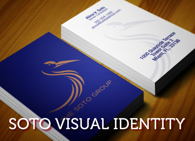
Arriving at every solution requires cooperation from both the designer and the client. Here’s how we solved the Soto Consulting Group LLC.
Read Article
Arriving at every solution requires cooperation from both the designer and the client. Here’s how we solved the Soto Consulting Group LLC.
Read Article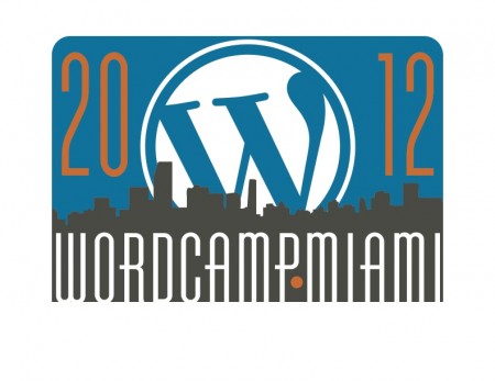
After attending last year’s Wordcamp Miami, I was all in for 2012. The team decided to give me a crack at the logo.
Read Article
How I solved the visual ID challenge of a client that I never met or spoke to personally. This job was brought to me through Armstrong Creative Consulting.
Read Article
Here are 3 ads that the ACC team worked on to promote the services of Taxdrz.com
Read Article
Good news, everyone. I was recently given the opportunity to design the graphics for Wordcamp Miami 2012 and …
Read ArticleWow! It’s been SIX years! I hope you enjoyed reading it as much as I did drawing it.
Read Article
The logo for Armstrong Creative Consulting has had many incarnations, but they each served their purpose at the time. As …
Read Article